
Look Good, Feel Good, Play Good?: NESCAC Baseball Uniform Power Rankings
I guess power rankings are kind of my thing now because here’s another one for you. Everyone knows baseball is 50% how you look, and that’s something that scouts take into account. The NESCAC has had numerous players selected in the draft and it isn’t all due to their playing performance – aesthetics are important. With this in mind, we thought it would be important to see who has the best uniform scheme in the league. I went through all the options and selected (in my opinion) the best uniform combo from each team, and ranked each team’s best 1-10. I apologize for not being able to find better pictures anywhere of some team’s jerseys (mainly Colby and Hamilton), but some schools just don’t make it easy.
10. Williams

The Ephs have a good color scheme to work with and quality hats, so they definitely have a sweet uniform right? Wrong. None of their uniforms are anything special, and their stirrups don’t even have stripes! This black top is simple, and I’ll admit I like the font choice. It doesn’t match the hats, but I like what they have there. Other than that, nothing too exciting here. I’m sure they’re comfortable but Williams is definitely not known for pleasing the eyes with their outfits.
9. Colby

Colby changes it up with some very patriotic lettering, and three stars on each sleeve. It’s kind of a weird look, and I certainly don’t hate it. That said, I really don’t like it that much either. Their hats don’t impress me and I’m glad they at least one-upped Williams by adding the stripes to their socks. I respect what they were trying to do here but I don’t think the execution was quite right. Ninth place.
8. Bowdoin

I really don’t mind Bowdoin’s uniforms at all. The strips on the sleeves go well with the stirrups and it’s a clean, classy look. I don’t love the hats, but they’re by no means a deal-breaker. The problem is it’s tough to put a team high in a jersey ranking when their colors are black and white. I think they have the potential for some nice all gray uniforms like their football team, but they really don’t have a whole lot to work with.
7. Hamilton

Blue is a popular color, and Hamilton makes it work. I actually think these uniforms are really nice. I’m a fan of the Nike top with the color on the shoulders, and the gray complements it nicely. I also like how they snuck some yellow into the stirrups, giving you a slightly different look. The hats are pretty much what you’d expect, but they go well with the uniform and add some blue to a uniform that doesn’t have a ton of color. Nice job here.
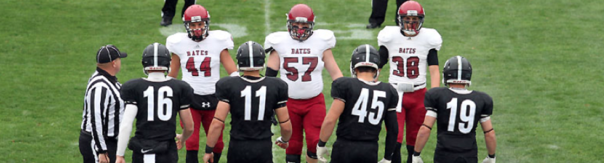
6. Bates

The Bobcats sport some quality red uniforms. Quality stirrups with a standard top that features one black and one white stripe on each sleeve. What sets this look apart a bit is the black hat with the red brim and a new “B” logo that Bates recently added. This is a very solid uniform that isn’t particularly flashy or showy, but the color combination looks nice and the contrast provides a nice crisp look.
5. Amherst

Now we get to see some efforts at new look home white uniforms. This is a great Under Armour top that mixes in just the right amount of purple. Their colors can be tricky to pull off, but the sneaky purple in the stirrups and the trim on the jerseys do a fine job for the Mammoths when you throw in the black hat on top of it. This is the way that the all-white uniforms are going for the many teams sponsored by Under Armour and I for one don’t hate it.
4. Middlebury

While Amherst had some solid whites, Middlebury hits us with their own effort at new-look white unis. This look is pretty basic, but the Panthers pull it off perfectly. The medieval font on the hat matches the logo on the jersey to a T (take notes Williams), and the navy stirrups provide just the right amount of additional color. These jerseys are all about class – we all want it, but Midd has it.
3. Trinity

I really like what Trinity has going on here. This is an awesome alternate uniform with a fantastic scheme. Too much yellow is never a good thing, but the trim on these unis along with the stirrup stripes offers just the right amount of secondary color. The fact that their hat reps the logo as opposed to a letter is a big time move and it looks really legit with “Bantams” written across the chest. Trinity’s athletic department continues to come up clutch, providing their athletes with the most cutting edge apparel available.
2. Wesleyan


I know a lot of people may have thought that Wesleyan’s pinstripes would make it on the list, but I absolutely love their throwback look. The gray is simple, and the piping and font choice add just the right amount of flare. The multi-colored stirrups along with the classy black hats contrast the gray nicely, and I really like the red flaps on the pockets. These uniforms are awesome and when you throw in their pinstripes and an alternate top, the Cardinals have a pretty legit arsenal of different looks.
1. Tufts

I’m not quite sure where to begin with these. Nice stirrups, a clean uniform, and a solid multi-colored hat tend to look good together. But these are different. These bad boys are all baby blue and I’ll be honest they’re downright scary. The Jumbos are 108-7* all time when wearing the baby blues, so their confidence when wearing these things must be through the roof. This jersey is a complete nightmare for opposing teams, and it’s the perfect outfit for the villains who have dominated the NESCAC for the last several years.
*probably not